December 3, 2013
Words
Knowing The Terminology Will Arm You To Be A Better Investor for Art Director SooJin Buzelli and Plansponsor magazine.


October 9, 2013
Cheating’s Surprising Thrill
For an article in the New York Times about the exhilaration of cheating. I've included two series of submitted sketches. After talking with the art director I did a second round focused on the high-fiving concept and the man pickpocketing the scientist, but I felt that there were still some concepts to explore so I couldn't help but include them as well.
I did a color version and a black & white version for both print and online use. Peter Morance was the wonderful art director.
September 8, 2013
Streetcar Faux Pas
For an article about a man new to Cincinnati who innocently mentions the city's streetcars in an attempt to make conversation at a cookout. Little did he know it was a controversial topic.
Fear of Flying
A new illustration for Cincinnati Magazine's Dr. Know column. It's about a great aunt who fears flying. After seeing a billboard on her way to the airport with a business logo that looks like an airplane's tail crashing into a lake, she drinks gin to calm her nerves.
June 27, 2013
New Webpage
I recently redesigned my webpage with an infusion of new work. Here is an opera singer at the zoo to give you a taste of the latest.
May 15, 2013
Maxim Magazine's Joke Page
For the last few months I've been illustrating Maxim Magazine's Joke Page. It's four jokes per month, and they're a lot of fun to draw. They're good conceptual exercise in coming up with ideas that complement the premise without giving away the punchline. David Zamdmer does the art direction and makes it a pleasure to work on.
April 19, 2013
No Gurls Allowed
April 3, 2013
Will The Postage Rate Hike Kill Independent Record Labels?
According to the labels, probably not. I've also attached some sketches. The deadline was tight so sketching was quick. For the Citypages.
Controlling Kid's Computer Use - Revisited
This was for a follow-up article in the Wall Street Journal Sunday edition about a mother setting rules for her daughter's computer use. Readers wrote in with their own experiences and suggestions on how to tame the computer distractions in an engaged and thoughtful way.
Here is the illustration for the original article:
Here is the illustration for the original article:
Therapy Art and Science
An illustration about the positive effects of a research-based approach to therapy, yet many therapists use a more unstructured, artistic approach that is less effective. I've also included the sketches for a taste of the creative (and sometimes ugly) process. For the New York Times.
February 22, 2013
Controlling Kid's Computer Use
This was for an article in the Wall Street Journal Sunday issue about the author's efforts to control her daughters' computer use for games, while still giving them the freedom to use it for homework and essentials. It felt good to go a little overboard with the colors and contrasts.
January 29, 2013
Society of Illustrators
I'm honored that my illustration about short-term relief was accepted into the Society of Illustrators 55th Annual Exhibition in the Editorial category. The original will be on display in the Society's show during the month of February and it will be printed in the Editorial category of the annual book. If you'll be in New York feel free to stop by and check it out.
Many thanks to SooJin Buzelli at Plansponsor for art directing and giving me the freedom to approach the piece in a more personal way.
Many thanks to SooJin Buzelli at Plansponsor for art directing and giving me the freedom to approach the piece in a more personal way.
Dr. Know Illustrations
Here are a couple of recent illustrations for the Dr. Know column in Cincinnati Magazine.
The first is about the history of a landmark called the Elsinore Arch and the mysterious stairway that rises up behind it. The stairs used to have a link to the Cincinnati Museum of Natural History.
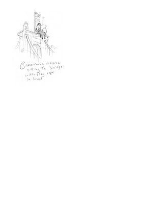
The second illustration is about the flags being perpetually at half-mast on the Kentucky side of the Roebling bridge.
I've included the sketches so you can see a bit of how my conceptual process works. These are the sketches I submitted to the client, so they don't include all the scribbling and rejected concepts that I edit out beforehand.
Subscribe to:
Comments (Atom)


